This module will introduce some basic graphs in Stata 12, including histograms, boxplots, scatterplots, and scatterplot matrices.
Let’s use the auto data file for making some graphs.
sysuse auto.dta
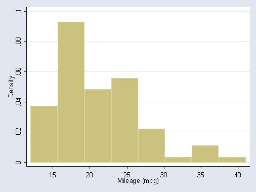
The histogram command can be used to make a simple histogram of mpg
histogram mpg
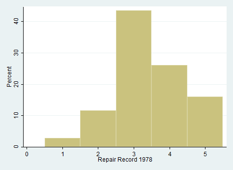
If you are creating a histogram for a categorical variable such as rep78, you can add the option discrete. As you can see below, when you specify this option, the midpoint of each bin labels the respective bar.
hist rep78, percent discrete
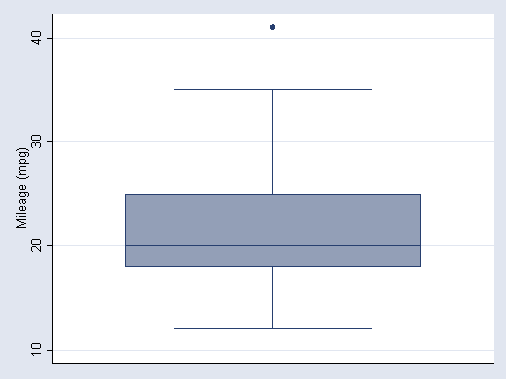
The graph box command can be used to produce a boxplot which can help you examine the distribution of mpg. If mpg were normally distributed, the line (the median) would be in the middle of the box (the 25th and 75th percentiles, Q1 and Q3) and the ends of the whiskers (the upper and lower adjacent values, which are the most extreme values within Q3+1.5(Q3-Q1) and Q1-1.5*(Q3-Q1), respectively) would be equidistant from the box. The boxplot for mpg shows positive skew. The median is pulled to the low end of the box.
graph box mpg
The boxplot can be done separately for foreign and domestic cars using the by( ) or over( ) option.
graph box mpg, by(foreign)
graph box mpg, by(foreign)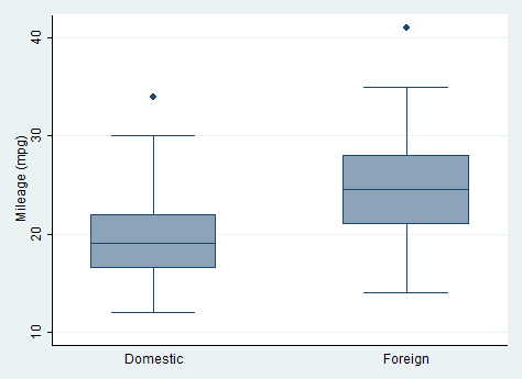
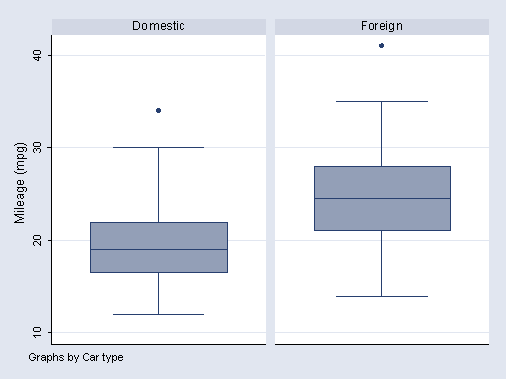
As you can see in the graph above, there are a pair of outliers in the box plots produced. These can be removed from the box plot using the noout command in Stata.
graph box mpg, over(foreign) noout
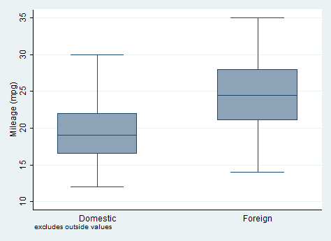
The graph no longer includes the outlying values. Stata also includes a message at the bottom of the graph noting that outside values were excluded.
Stata can also produce pie charts.
graph pie, over(rep78) plabel(_all name) title("Repair Record 1978")
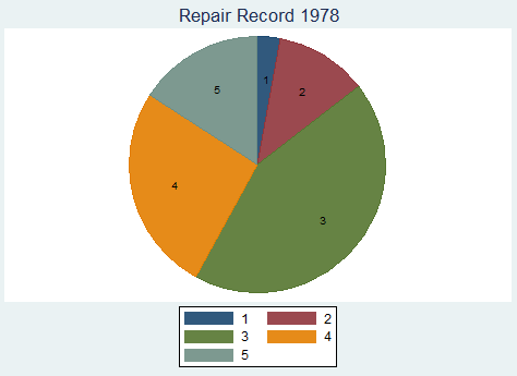
The graph pie command with the over option creates a pie chart representing the frequency of each group or value of rep78. The plabel option places the value labels for rep78 inside each slice of the pie chart.
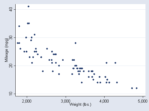
A two way scatter plot can be used to show the relationship between mpg and weight. As we would expect, there is a negative relationship between mpg and weight.
graph twoway scatter mpg weight
Note that you can save typing like this
twoway scatter mpg weight
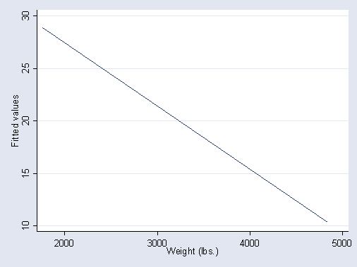
We can show the regression line predicting mpg from weight like this.
twoway lfit mpg weight
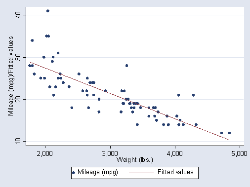
We can combine these graphs like shown below.
twoway (scatter mpg weight) (lfit mpg weight)
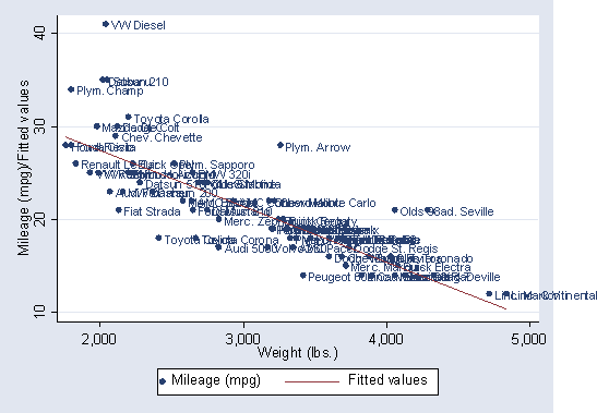
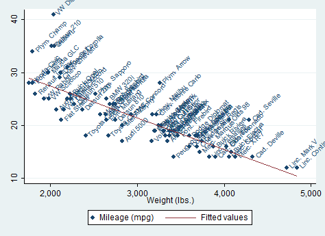
We can add labels to the points labeling them by make as shown below. Note that mlabel is an option on the scatter command.
twoway (scatter mpg weight, mlabel(make) ) (lfit mpg weight)
The marker label position can be changed using the mlabangle( ) option.
twoway (scatter mpg weight, mlabel(make) mlabangle(45)) (lfit mpg weight)
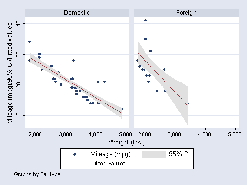
We can combine separate graphs for foreign and domestic cars as shown below, and we have requested confidence bands around the predicted values by using lfitci in place of lfit . Note that the by option is at the end of the command.
twoway (scatter mpg weight) (lfitci mpg weight), by(foreign)
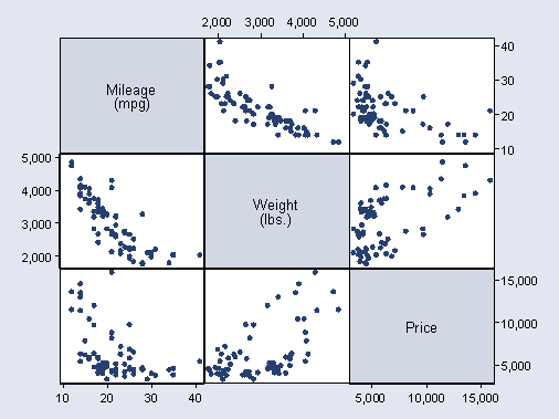
You can request a scatter plot matrix with the graph matrix command. Here we examine the relationships among mpg, weight and price.
graph matrix mpg weight price